Logo design, brand repositioning and a Squarespace rebuild for a personal trainer specializing in women's fitness and hormone balance.
Great Life's Work redesigned Active Balance from the ground up: new logo, new Squarespace website, repositioned brand messaging and a lead magnet campaign. The goal was to take a personal trainer with serious credentials and make her digital presence match the caliber of her coaching.
A Squarespace website redesign built on brand strategy attracts qualified leads and builds trust from the first scroll. This case study breaks down what we did for Active Balance and the moves that turned a generic trainer site into a conversion-ready platform for science-backed women's fitness coaching.
Rachael is a certified personal fitness trainer and nutrition coach based in Wauconda, IL. She has competed in nationally ranked bodybuilding shows, coached marathon runners and holds certifications spanning strength training, sports performance, yoga, cycling and peri/postnatal fitness. She works primarily with women navigating perimenopause, helping them reclaim energy, build strength and understand their changing bodies. See the full site at activebalance.me.
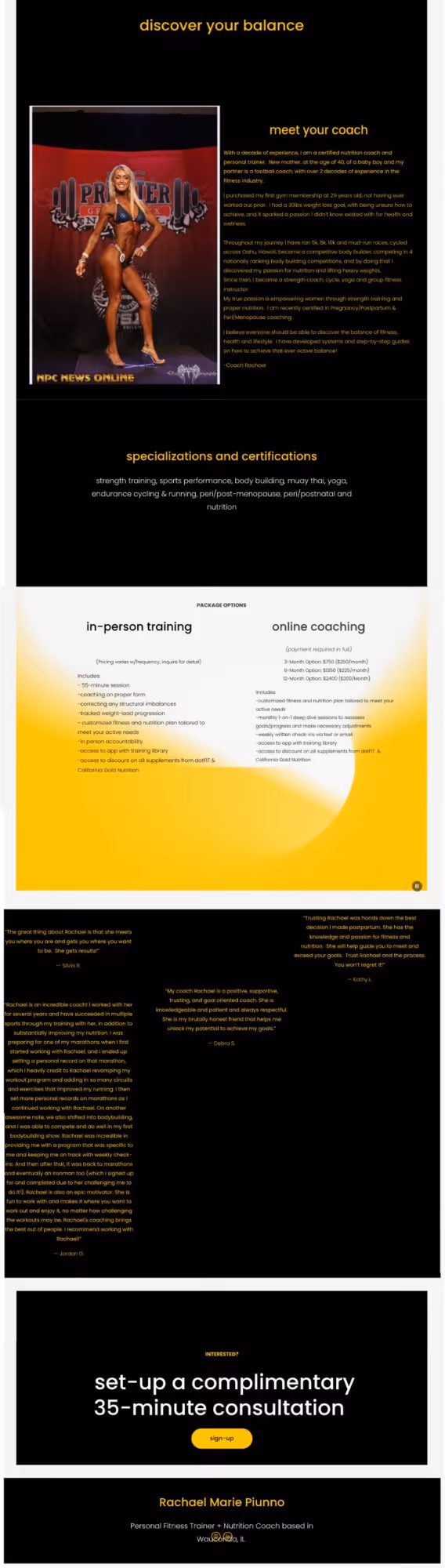
Her original website had the bones of something real. But the positioning was broad, the design was dated and the messaging did not reflect the depth of what she actually offers. Her strongest credential, a Dr. Stacy Sims-informed approach to women's fitness, was buried. The site read like a generic personal trainer page when the work behind it was anything but.
That disconnect between credentials and online presence is common for fitness professionals. The expertise is there. The brand positioning has not caught up yet.
The biggest shift was not visual. It was strategic.
Rachael's original site presented her as a general-purpose personal trainer with package options and pricing. The new site positions her as a science-backed coach specializing in women's fitness, hormone balance and body composition. That distinction changes who finds her, who trusts her and who books a consultation.
Her credentials became the lead. Her Dr. Stacy Sims training, her peri/postnatal certifications, her competitive background. None of that was on her original site. We pulled those credentials out of the bio and put them front and center where they could do real work. One of those credential placements directly led to a new client conversion.
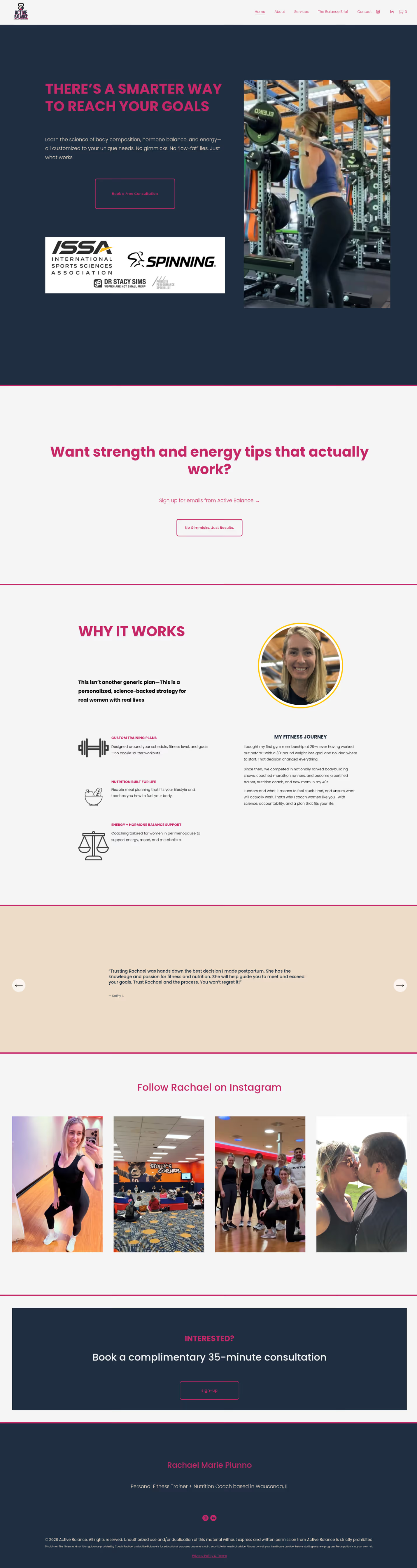
The hero image changed too. The original featured competition bodybuilding photos, which are impressive but can feel intimidating to her target audience: women in their 30s-50s who feel stuck and want a coach who gets it. The new photo is strong and approachable. It says "I have been where you are" instead of "look at what I have achieved."
Brand positioning drives website conversions for fitness professionals. The same credentials that sat buried on Rachael's old site became her most powerful trust signal once we put them in the right place. This approach to strategic marketing is the foundation of everything we build at Great Life's Work.
The Active Balance logo features a macros-inspired mark with bold, condensed typography in black and gold. The mark represents the balance of macronutrients at the core of Rachael's coaching philosophy. Clean, punchy and immediately recognizable at any size.
V1: BLACK + GOLD
V2: NAVY + MAGENTA
Same macros-inspired mark. The brand has continued to evolve since the initial launch.
The full site was redesigned in Squarespace with new messaging, new layout and a structure built for conversion. The homepage leads with "There's a Smarter Way to Reach Your Goals" and immediately communicates three service pillars: Custom Training Plans, Nutrition Built for Life and Energy + Hormone Balance Support.
The testimonials section was restructured to highlight the breadth of her client results, from postpartum recovery to marathon PRs to bodybuilding competitions. Social proof that speaks to the range of women she serves.
A holiday fitness mini guide was designed as an email lead magnet. The concept was simple: give prospective clients a taste of Rachael's coaching philosophy through a seasonal, low-commitment entry point. The guide was built to capture emails and funnel leads toward her consultation booking page. Lead magnets like this are a core part of how we approach content strategy.
Dark background with competition photos, generic "Discover Your Balance" tagline, pricing tables and a long-scrolling bio section. The site spoke to other fitness enthusiasts rather than the women Rachael actually wanted to coach.
Clean sections with bold typography, approachable photography, credential-forward positioning, defined service pillars and client testimonials organized by outcome. The site now speaks directly to women who want science-backed coaching without the gym-bro energy.
"You gave me my identity. Before this, I was a stay-at-home mom with a highlighter-yellow website and no idea how to show up online. You pulled out who I actually was, made everything cohesive and gave me the confidence to promote myself and my work. I literally tripled my income."
Rachael Marie Piunno Your Coach, Active BalanceIn Her Own Words
Rachael covers how brand strategy helped her triple her income, how a new client found her through Google without social media and what it actually looks like when positioning does the work it is supposed to do.
The Dr. Stacy Sims certification and peri/postnatal specializations were not on the original site. Adding them near the top of the new site turned hidden expertise into a trust signal. This directly led to a new client conversion.
Swapping bodybuilding competition photos for approachable coaching imagery made the site feel welcoming to Rachael's actual target audience.
Moving from "personal trainer for everyone" to "science-backed coaching for women" sharpened the message and attracted the right leads.
Three clear service pillars replaced a generic package pricing table, making it easy for visitors to see themselves in the offer.
A seasonal fitness guide gave prospective clients a low-risk entry point into Rachael's coaching world while building her email list for long-term nurturing.
Cost depends on scope. A redesign that includes brand strategy, logo design, messaging, page layout and content creation is a more significant investment than a template swap with new photos. At Great Life's Work, our redesigns start with strategy and build from there.
When it is driven by positioning, yes. A redesign that restructures your message, puts your credibility up front and speaks directly to your ideal client changes who reaches out. For Active Balance, a single credential placement led to a new client booking.
Almost always. A site that tries to speak to everyone ends up resonating with nobody. Rachael's original site positioned her as a general trainer. The redesign focused on women's fitness, perimenopause coaching and science-backed nutrition. The messaging got sharper and the right clients started paying attention.
A website redesign can be purely visual. A brand refresh includes messaging, positioning and strategy. For Active Balance, the project included both: new logo, new site and a completely repositioned brand message. The visual design serves the strategy.
Timeline varies depending on scope and how quickly content and assets come together. A full redesign with brand strategy, logo, messaging and page builds typically takes four to eight weeks. The strategy phase is where the real work happens and should not be rushed.
Let's figure out what's holding your brand back and build the site that changes the game.
Work with GLW